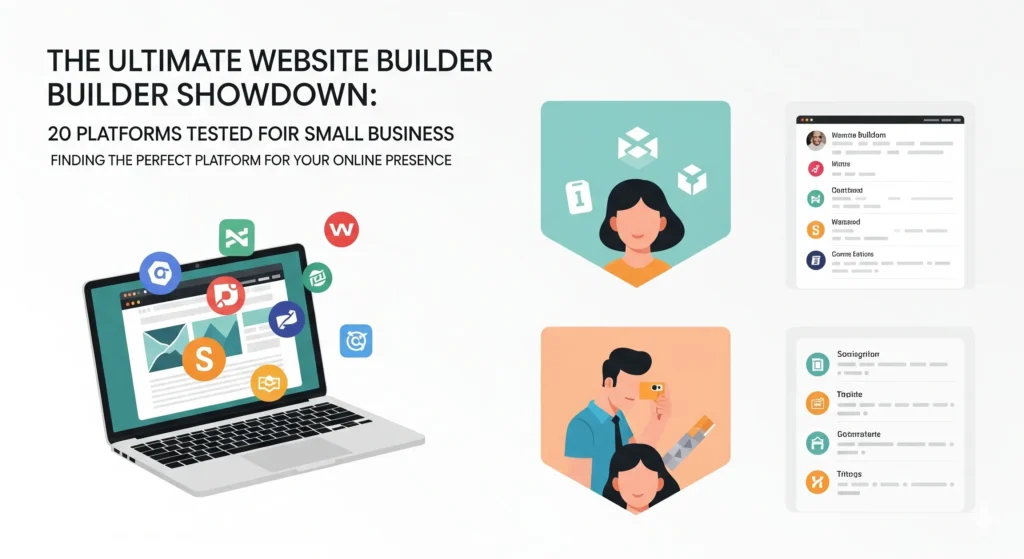
Imagine building the same site 20 times. I paid for 20 different tools with my own card. Each time, I aimed for one goal: find the top website builder.
This test came from a real need. My rock band, Bamboo, paused after 12 years. Kids slowed us down, but we’re not done. Our old site died. I noticed months later. That hit hard. It pushed me to rebuild. The band page isn’t fancy. It has basic parts like a home screen, bio, and photos. This setup fits small shops or personal spots too.
Your small business needs a solid online home. Many waste time picking tools. I did the work for you. This guide cuts through the mess. You’ll see what fits a simple site without the hassle.
I sketched a basic plan. Top menu for easy jumps. A big photo with our slogan up front. A simple bottom bar. Extra pages for bio, shows, and contact. I wrote our story, grabbed videos, and picked images. One key pic sets the hero spot. Ready to test.
Category 1: The “Definitely Not” Zone: Red Flags and Limitations
Some tools fail fast. They show tricks or big limits right away. These land in the no-go pile.
Red Flags: Deceptive Practices and Poor User Experience
Watch for shady moves in website builders. They can sour your start.
GoDaddy: The Sneaky Upsell
I tried buying a basic plan. My cart had two items. One was the site. The other? A Microsoft 365 email add-on. I removed it. It popped back. Priced at $0, it hid well. No cost now, but charges hit later—$130 a year. That’s a trap. I skipped them.
Mailchimp: The Tricky Opt-Out
Sign-up felt off. A box said: check to avoid emails. No, it opted me in by leaving it blank. Most folks miss that flip. It screams bad trust. Then, checkout promised a June charge. It came May 20. Two weeks early. I built the site anyway. But these slips scream avoid.
These acts treat users wrong. A good builder builds trust first. Skip ones that don’t.
Basic Functionality, Limited Customization: Google Sites
Free sounds great. But it often means cuts elsewhere.
The Free Trade-Off
Google Sites costs nothing. I added our band info. No way to shift text down like I planned. It auto-darkens images. Can’t fix that. Preview shows a search bar in the menu. No off switch. Can’t swap for a button either. On phones, extra icons stick around.
It’s fine for school projects. Think class pages or quick notes. For a real site, it’s too locked. You get basics. No tweaks. That limits your look.
Category 2: Blank Canvas vs. Structured Sections
Tools split here. Some let you drag free. Others force set blocks. Each has pros and cons.
The Illusion of Freedom: Canva’s Blank Canvas Editor
Full control seems fun. Drag stuff anywhere. But sites need rules.
Why Structure Matters: Responsive Design
Sites hit phones, pads, laptops. All sizes. Responsive means it fits each. Stretch images on big screens. Stack menus on small ones. Test by pulling your window edges. Good sites shift smooth. No breaks. Bad ones shrink or hide parts. That’s key for visitors.
Canva’s Shortcoming
Canva lets you place items loose. Like a paper page. I dragged our menu off screen by mistake. Resize the window? It just squishes. Menu text turns tiny. No auto-fix. Without built-in guides, it flops on devices. Great for graphics. Not sites.
The Cookie-Cutter Approach: Section-Based Editors
Pre-made chunks speed things up. But rigidity bites back.
Square’s Section Limitation
Square offers ready blocks. Add one for text or links. This block has title, words, button. Toggle off what you skip. Can’t add new bits. No moving inside it. For the footer, two choices. Neither matched my plan. I’d shift parts if possible. Stuck as is.
The “Good Enough” Trap
Sections save time at first. Pick and drop. Quick win. But soon, it feels bland. All sites look same. No unique touch. On my graph, easy use scores high. Custom power? Low. You want both. These tip too far to simple.
Category 3: “Just Okay” Builders: Progress with Caveats
These get closer. I built near what I wanted. But snags held them back.
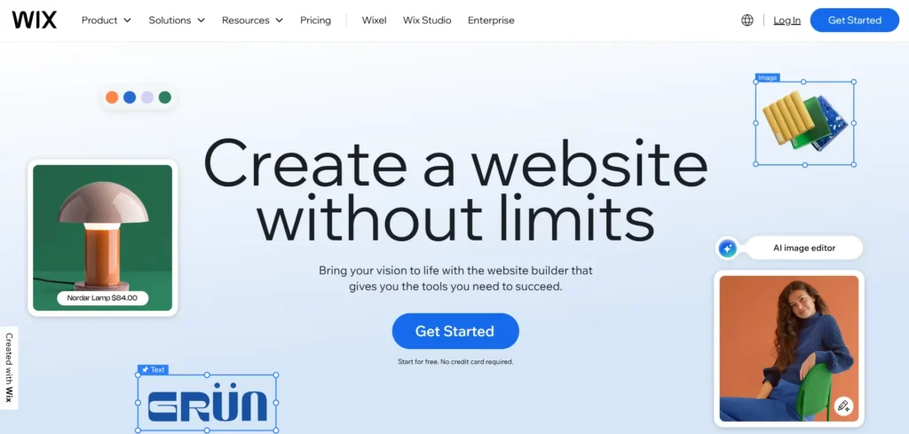
Wix: Clunky Interface, Inconsistent Responsiveness
Wix works. Sort of. Steps feel rough though.
Strips and Gridlines Explained
They use strips for layout. Split into columns. Dashed lines show safe zones. Step out? Parts vanish on some screens. I fumbled to learn it. Trial after trial. Not smooth.
The Responsive Design Gap
My final Wix site looked okay big. Resize small? Bottom text dips out. Gone. A true responsive one keeps it pinned. Side by side, Wix lags. It shifts width. Ignores height. Visitors on tiny phones suffer. That’s a miss for pro looks.
Overwhelming and Confusing: Duda, 1&1, WordPress.com, Web.com
A few others share this vibe. Close but messy.
A Trial-and-Error Experience
Duda’s editor hides menus. Hunt for options. Frustrating. 1&1, WordPress.com, and Web.com act similar. I got 80% right. But paths twisted. Not clear steps. You guess more than build. Fine for basics. Tires you out.
Category 4: AI Integration and Budget-Friendly Options
Tech trends mix in. AI promises easy. Cheap picks tempt too.
The AI Hype vs. Reality: AI-Powered Website Building
AI sounds magic. Build a site from words. But results vary.
AI Website Generation Limitations
Durable spat out a page. Thought Bamboo sold stuff, not music. Squarespace’s AI gave vague blocks. Wix added a fake singer pic. Framer tried best. Still rough edges. None nailed our band feel. Start with templates instead. They fit better. AI sites need heavy edits.
AI Text and Image Generation
Text tools help now. Prompt for bio tweaks. Most builders have it. Handy for drafts. Images? AI pics look stock. Bland faces, no soul. Skip for personal touches. Use real photos. AI shines small, not whole sites.
Budget-Conscious Choices: Hostinger and Carrd
Save cash without big cuts. These shine there.
Hostinger: The Introductory Price Trap
Hostinger keeps it basic. Few add-ons. I couldn’t trim button space. No fancy store or blog tools. But cost? $2.99 a month for four years paid up front. Wild low. Renews at $10.99. Fair. Screenshot that rate. Lock it in. Watch for hikes.
Carrd: The One-Page Specialist
Carrd fits all on one scroll. I squeezed Bamboo there. Not ideal. But $19 a year? Beats most monthly fees. No intro trick. Just cheap. Interface? Clunky spots. If your biz fits one page, grab it. Best value niche.
Category 5: Design Tools and The Goldilock Zone
Power users love these. Everyday folks? Maybe not.
Developer-Level Control: Webflow and Framer
These give pro tools. Deep tweaks.
What is a Design Tool?
Webflow hands CSS rules. Pick text. Adjust like a coder. Flexbox for layouts. Positioning for spots. Folks clone Apple sites in it. Total freedom.
The Steep Learning Curve
Power means study. Navigation took hours. Learn web basics first. Weeks to get good. Framer eases a bit. Still steep. On the graph, max custom. High effort.
When to Use Design Tools
Skip for simple bands. Overkill. Use for big jobs. My software firm, Atlas? Webflow built our site. Custom slides, calcs, animations. Help center too. Pros pick these. For small biz, stick simpler.
The Verdict: Squarespace – The Balanced Winner
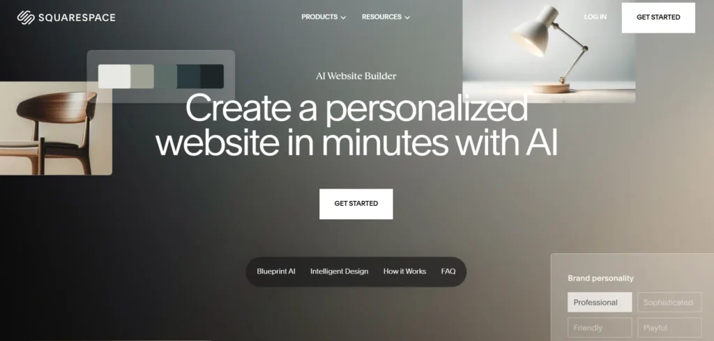
After all that, one stood out. Squarespace nailed it.
Achieving the Vision
I got the exact look. Chose glow effects for the quote. Pops nice. Mobile menu stays neat. No clutter after changes.
The Sweet Spot: Ease of Use and Customization
Pick sections easy. Need tweaks? Dive in. Move elements. Set site colors quick. Or fine-tune button padding. Most skip deep edits. Good to have options.
True Responsiveness
It adapts full. Every size. No hides or shrinks. Looks sharp always.
The Goldilock Zone Defined
Squarespace fits just right. Easy start. Custom when needed. Not too locked like sections. Not wild like design tools. Perfect for shops, blogs, portfolios. Band sites too. Not Apple-level. But for most? Spot on.
Conclusion: Learnings from the Website Builder Marathon
Hands-on beats talk. I built 20 sites. Each taught quick. Feel the flow. Pick what clicks.
Bamboo’s page lives on Squarespace now. Shows we’re paused, not gone. Dads rocking indie. Toronto show brews. Details soon there.
Try these yourself. Links below to tools, notes, my builds. Save your time. Build smart. Your site waits.